Nuklai Brand Design
From Data Tunnel to Nuklai — 20+ logo concepts, one direction selected with the CEO, and a complete brand identity system built to scale from token icons to large marketing placements.
The Project
Nuklai is a Dutch blockchain company building a Layer 1 for data economies, with a shared data marketplace designed for AI and LLM use cases. As the story evolved from Data Tunnel to Nuklai, the brand needed a clearer, more confident identity to represent the next stage of the company.
This project focused on the core foundation: exploring multiple logo directions, aligning on a single concept with the CEO, then defining the supporting palette and typography so marketing could roll it out consistently.

My Role
Brand & Product Designer. Owned logo exploration through 20+ concepts and built the supporting identity system end to end.

Scope
Logo system, typography, color palette, clear space and lockup rules. Concepts explored in Illustrator, system documented and presented in Figma.

Collaboration
CEO Matthijs de Vries, creative direction and sign off on every concept round.
The Challenge
Build a brand that feels credible for data and AI, not "generic crypto." Nuklai needed a new mark and a clean identity foundation that could scale from small digital sizes to large placements, while staying consistent across marketing and future product surfaces. The rebrand also had to respect the Data Tunnel legacy, keeping a recognizable thread while moving the company forward under the Nuklai name. The logo had to hold up across small, medium, and large screen sizes, feel modern and non-generic, and clearly stand apart from typical crypto aesthetics. Color was part of the challenge too: marketing pushed for green, so I worked it into a palette that still felt premium and tech-forward.

Reading the existing mark
Web3 logos still need to be instantly recognizable, but the context is different. The mark often represents a network or token within an ecosystem, not a single product company. It has to work as a tiny icon in wallets, exchanges, and explorers next to a ticker, while still holding up across core brand touchpoints. This audit focused on what the symbol needed to signal at a glance.
Competitor audit
19 marks reviewed for silhouette strength and token-size readability — before a single concept was sketched.


Setting the criteria
Before sketching a single concept, the reference audit needed to translate into a shared filter. Three non-negotiable criteria emerged — each one anchored to a specific weakness found in the existing mark or the competitive landscape.

Data Tunnel legacy
The existing mark was too abstract and interchangeable. The new identity needed to carry forward a sense of motion and flow — without becoming another forgettable crypto token.

Token-ready scale
The mark had to hold at every size: 16×16 favicon, app icon, tokenomics deck, large billboard. Single-color, reversed, horizontal, stacked — any context, without losing recognition.
Modern and distinct
No gradients, no generic blockchain hexagons, no overused fintech clichés. The mark had to stand alone and still feel unmistakably Nuklai — recognizable before the name is read.
Building the System
20+ logo concepts were sketched, narrowed to five directions, and reviewed with the CEO. From there, the strongest concept was developed into a complete brand system — typeface pairing, safe space rules, and a full color palette.
Logo Construction
A modular mark built on clarity and balance. Every curve and angle follows a single underlying geometry for perfect harmony.


Built on a single geometric ratio

Scales from icon to billboard

Designed for motion systems
Typeface & logo
Two type-pairing directions were explored alongside the approved mark — testing how the wordmark integrates with different weight and spacing choices.


Safe space
Minimum clear space rules defined for both the symbol mark and the horizontal lockup — ensuring the logo is never crowded in any application.


Color Space
A refined palette built for contrast, accessibility and expressiveness. Each color serves a clear role across the brand experience.
Primary Colors
Secondary + Illustration Colors
Neutral Colors
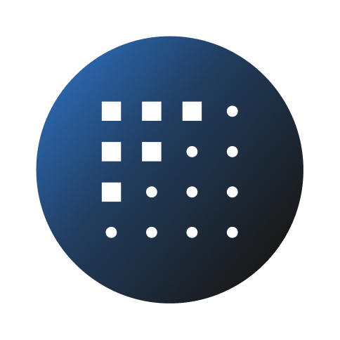
Final logo system
The approved mark across all primary applications — on light, on dark, single-color, and reversed. Every variant export-ready and sized for production use.


Handing off the system
The approved identity was packaged into a complete brand system — every file the team would need to apply the mark consistently from day one.
What was delivered
Approved logo package
All mark variants — color, mono, and reversed — in SVG and PNG, sized for every use case from app icon to print.
Export-ready files
Production exports in all required formats — ready for the dev team, marketing, and external partners to use immediately.
Brand system sheets
Typography, color palette, logo overview, and logo system — documented as shareable reference sheets for the whole team.
Before & After


Data Tunnel → Nuklai
Brand system sheets


Scalable brand system
The mark was extended into the Nuklai product family — each sub-brand inherits the core identity while staying distinct within the ecosystem.

